January 2025
 Since 2015, we have been examining global temperatures on a yearly basis. This publication continues our examination of how control charts can be used to analyze global temperature changes over time. Last January, we asked if 2023 was the hottest year on record. And the answer was yes, it was- by a large amount.
What about 2024? Was it hotter than that record year in 2023? The answer is yes it was. 2024 is the hottest year on record in the time frame from 1880 through 2024. What do run charts and control charts tell us about the temperature changes over time?
We analyze the temperature data from two different perspectives. One is that there is an ongoing upward trend in global temperatures. The other is that the upward trend is better explained by a series of step changes, with each step change being in statistical control. The last two years have been out of control from both perspectives. This means that the rate of change in the annual global temperature deviation is higher for those two years than previous years.
In this publication:
- Global Temperature Data
- Global Temperature Viewed as a Trend Control Chart
- Setting a Baseline for the Annual Global Temperature Deviation
- Global Temperature Viewed as Step Changes Over Time
- Summary
- Quick Links
Please feel free to leave a comment at the end of this publication. You can download a pdf copy of this publication at this link.
Global Temperature Data
The global temperature data used in this publication is taken from the National Aeronautics and Space Administration (NASA), in particular the Goddard Institute for Space Studies. You can access the data used in this publication at this link. You want to download the data that is labelled “Global-mean monthly, seasonal, and annual means, 1880-present, updated through most recent month.”
Note that there is no attempt to suggest why global warming is occurring. This publication simply looks at what can be learned by focusing on the temperature data itself.
The data are not given as absolute temperatures. Instead, the data are given as deviations from a baseline period. The baseline period used was from 1951 to 1980. The temperature during this baseline period was stable, as we showed in an earlier publication: SPC and Global Warming: 1880 – 2021.
The data are reported monthly. The average deviation for a year is then calculated. The deviations are given in degrees Celius. Table 1 shows the monthly global temperature deviations for 2024.
Table 1: 2024 Monthly Global Temperature Deviations
|
Month |
Deviation |
Month |
Deviation |
|
|
Jan-24 |
1.24 |
Jul-24 |
1.20 |
|
|
Feb-24 |
1.44 |
Aug-24 |
1.30 |
|
|
Mar-24 |
1.39 |
Sep-24 |
1.23 |
|
|
Apr-24 |
1.31 |
Oct-24 |
1.33 |
|
|
May-24 |
1.16 |
Nov-24 |
1.29 |
|
|
Jun-24 |
1.24 |
Dec-24 |
1.26 |
For example, the temperature deviation for January 2024 was 1.24°C above the baseline data from 1950 – 1981. The 2024 average global temperature deviation is simply the average for the 12 months. That value is 1.28. So, for 2024, the annual global temperature deviation was 1.28 above the baseline data.
Figure 1 is a run chart for the annual global temperature deviations from 1880 – 2024. The average is included – although it really doesn’t mean anything at this point. All charts in this publication were made with the SPC for Excel software.
Figure 1: Annual Global Temperature Deviations (1880 – 2024)

It is easy to see when the upward trend started back around 1987 or so. And it is also easy to see that the last two years have had big steps upward – and they are the hottest two years since 1880.
There is a 12 month period from September 2023 to August 2024 where each monthly global temperature deviation is a record. The 12 month average for that time period is 1.32, more than the annual global temperature deviation of 1.28 for 2024.
The run chart, while a good visual, doesn’t really tell us much about the stability of the process. To do that, we will look at the data from two perspectives: as a trend control chart and as a series of step changes over time. We will start with the trend control chart.
Global Temperature Viewed as a Trend Control Chart
It is clear in Figure 1 that there is an upward trend in the data that starts about 1987. Suppose we wanted to do a control chart on the data since 1987. What do you think the control chart will look like?
We will use an individuals (X-mR) control chart to analyze the results. The individual results (each annual global temperature deviation from 1987 to 2024) are plotted on the X chart. The moving range between consecutive years is plotted on the moving range (mR) chart. Figure 2 below is the X chart. Figure 3 is the mR chart.
Figure 2: X Chart for Annual Global Temperature Deviations (1987 – 2024)

Figure 3: mR Chart for Annual Global Temperature Deviations (1987 – 2024)
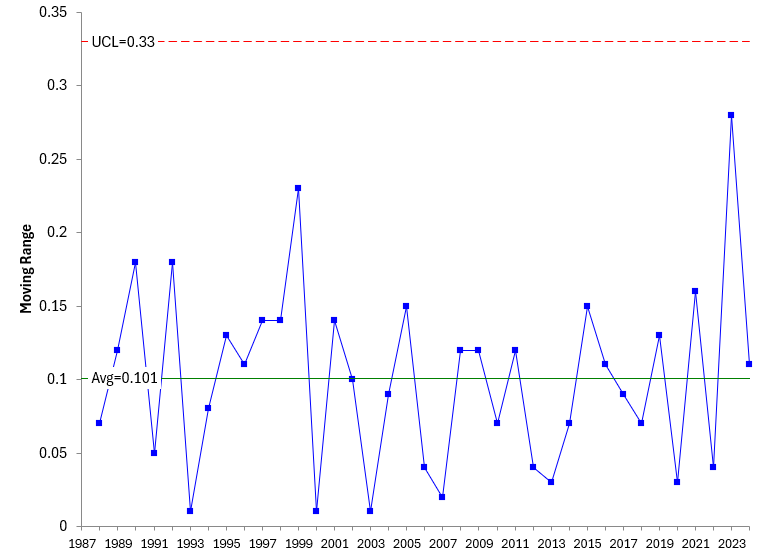
Figure 3 shows out of control points in red. It is clear that a trending process does not work well with a classical X chart. Figure 4, on the other hand, is in statistical control. The moving range is consistent and predictable. There are no points beyond the control limits and no patterns.
What do we do to make the X chart useful? We convert it to a trend control chart. How do we do this? An earlier publication, Trend Control Charts and Global Warming, showed how this was done. The data are updated here.
The equations for the average and control limits for the charts in Figure 2 and Figure 3 are given below.
X Chart
X = SX
UCLx = X + 2.66R
LCLx = X – 2.66R
mR Chart
R = SR/(k-1)
UCLr = 3.267
LCLr = None
where X and R are the overall average of the X values and mR values respectively, UCL and LCL are the upper and lower control limits respectively, and k is the number of points. There is one less mR value than X value since mR is the moving range between consecutive points.
To construct a trend control chart, we need to replace the overall average in Figure 2, which is a straight line, with the best-fit line for the data. The equation for the best-fit line is:
Xt= mt + b
where Xt is the annual global temperature deviation, t is the year, m is the slope of the line and b is the y-intercept. You can determine this best-fit line by running a regression. The SPC for Excel software will do it for you if you select the trend option.
The best-fit line is given below:
Xt= mt + b = 0.021875t – 43.2402
The value of m represents the rate of change in the global temperature deviation per year for this time period. It means that the rate of change is 0.021875°C per year, i.e., the annual global temperature deviation is increasing about 0.02 °C per year.
You then substitute this equation for the average into the control limit equations. So, the control limits for the trend control chart are given by:
UCLx = mt + b + 2.66R = 0.021875t – 43.2402 + 2.66R
LCLx = mt + b – 2.66R = 0.021875t – 43.2402 – 2.66R
Note that the control limits will trend with the average, and the distance between the average and the control limits will be 2.66 times R .
You can use the equations for Xt and the trend control limits on the X chart. Figure 4 is the trend control chart.
Figure 4: Trend Control Chart for Annual Global Temperature Deviation (1987 – 2024)
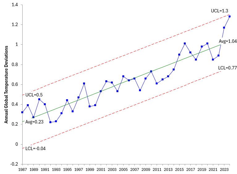
The average and control limits for last year (2024) are then given by:
Xt= mt + b = 0.021875t – 43.2402 = 0.021875(2024) – 43.2402 = 1.0348
UCLx = mt + b + 2.66R = 0.021875t – 43.2402 + 2.66R = 0.021875(2024) – 43.2402 + 2.66(0.101) = 1.30
LCLx = mt + b – 2.66R = 0.021875t – 43.2402 – 2.66R = 0.021875(2024) – 43.2402 – 2.66(0.101) = 0.77
The trend chart in Figure 4 is in statistical control. No points beyond the control limits and no patterns. We could use the above equations to predict the value of Xt for this year as well as the control limits. We do that by using 2025 instead of 2024 in the equations.
From Figure 4, we conclude that the annual global temperature deviation will continue to increase in the near future. There is no indication that this will change anytime soon.
All the data from 1987 to 2024 was used in the calculation of the average and control limits in Figure 4. That is not always the best way to use a control chart. Let’s look at setting a baseline for the annual global temperature deviation.
Setting a Baseline for the Annual Global Temperature Deviation
The best way to use a control chart to monitor a process is to determine a period where the process is in statistical control and then lock the average and control limits. Those set average and control limits are then used to judge future performance. Again, Figure 4 used all 38 years of data after the upward trend started in calculating the best-fit line and control limits.
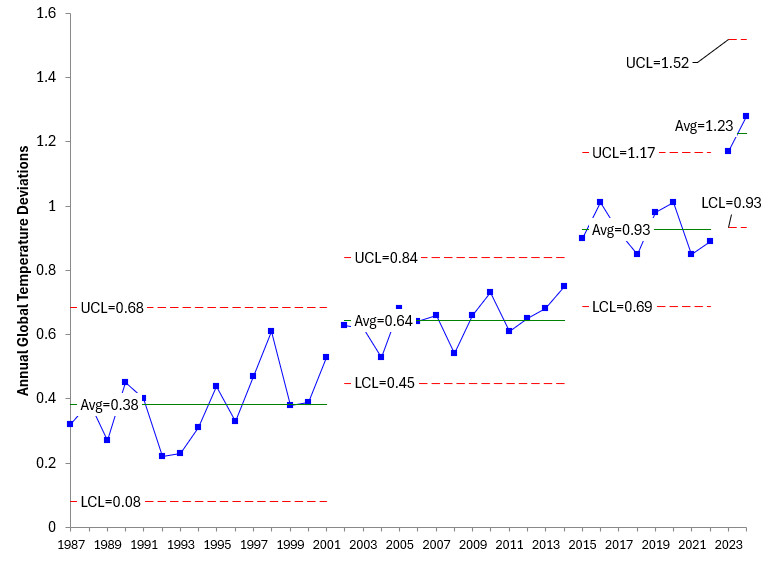
Suppose we used the first 25 points after the upward trend started as the baseline data and set the best-fit line and control limits based on those 25 years. We then extend the best-fit line and control limits into the future and judge the results against those. Figure 5 shows the results using a baseline based on the first 25 years after the upward trend started (1987 – 2011).
Figure 5: Trend Control Chart for Annual Global Temperature Deviations with Set Limits

Using the baseline data approach, the control chart shows that the last two years have been out of statistical control. Those two years are significantly different than those that would be predicted on the baseline data. The rate of yearly change is higher than it has been in the past. Now, let’s examine the data from a different perspective.
Global Temperature Viewed as Step Changes Over Time
There is a challenge when examining data that is trending upward or downward. Is there an actual trend (like indicated above) or can the trend be explained by a series of step changes in the data? We have examined this over the past few years in our previous publications on global warming.
Essentially what you do is examine the data and look for periods of stability. This has been done for the data since 1987 and is shown in Figure 6.
Figure 6: Annual Global Temperature Deviation as a Series of Step Changes

Figure 6 shows that there have been three periods of stability since 1987. These start in the years 1987, 2002, and 2015. The data from 2015 to 2022 was used to set the control limits for the last period. You can see that the last two years have been out of control also.
It looks like there may have been another step change in the annual global temperature deviation. This basically shows agreement with the trend control chart. It is interesting that the periods of stability between a step change up are getting shorter (fewer years).
The rate of change is increasing from 0.38 for the first period of stability, to 0.64 for the next and 0.93 for the last period. The last two years represent the start of a new period of stability. Figure 7 shows this new period. The average for the last two years indicates that the rate of change is now 1.23.
Figure 7: Annual Global Temperature Deviation as a Series of Step Changes with New Stage
Based on this control chart, one would expect the annual global temperature deviation to form a stable pattern for several years, before the next step change upward. There is nothing to indicate that global warming is slowing down.
Summary
This publication has continued our look at global warming using the annual global temperature deviation. The data covers the period from 1880 – 2024 with an emphasis on the data from when the upward trend started (1987). There was no attempt to explain the reason for the increase during this time period – just to analyze the data.
The data were examined from two perspectives: as a trend control chart and as a series of step changes on a control chart. In both cases, the last two years (2023 and 2024) have been out of statistical control on the high side. This means that the rate of change is significantly greater over the last two years when compared to previous years. Global warming is not slowing down.