October 2025
 Control charts have been used for decades to help with manufacturing quality. Control charts work, pure and simple, as has been seen by the multitude of success stories. Over the past years, things have changed significantly. Work has moved online, and the process no longer just means the manufacturing line. It now includes digital processes – code releases, support tickets, response time, cloud usage, etc.
These digital processes produce data – streams and streams of data. And what does a control chart do? It takes the data and puts it in format to tell us if our process is stable (only common causes of variation present) or is unstable (special causes of variation present). Basically, the control chart answers the question:
Is the process changing?
This publication takes a look at how to apply control charts to digital processes. In this publication:
- What is a Digital Process?
- Control Charts
- Reasons to Use Control Charts in Digital Processes
- Application of Control Charts in Digital Processes
- What Type of Control Chart Should Be Used with Digital Processes?
- Summary
- Quick Links
Please feel free to leave a comment at the end of the publication. You can download a pdf copy of this publication at this link.
What is a Digital Process
What is a digital process? According to one website:
“A digital process refers to any structured business activity or workflow that is executed, supported, or managed using digital technologies. These processes replace traditional manual methods — such as paperwork, phone calls, and spreadsheets — with automated workflows, web-based systems, cloud applications, and data integrations.”
A simple example of a digital process involves going to the doctor’s office. Those of us who are old enough remember having to fill out page after page of information manually – with a pen. This old manual process has been replaced with a digital process where you fill out information on-line at the doctor’s website or via the doctor’s app on your phone.
Control Charts
Companies often use dashboards to get a “picture” in time of your performance. We seem to drown in the number of metrics. And the metrics usually don’t tell us anything about the underlying process. They tell us how we performed this month versus last month, this quarter versus last quarter, this year versus last year, etc.
The control chart provides us with insights into the underlying process. Are things staying the same? Are things getting better? Are things getting worse? How can a control chart do this?
All data has variation. Most of the variation is simply noise – normal variation in the process. But some variation is a signal – something has changed in the process. The only way to effectively sort the signals from the noise is through a control chart.
Suppose we run monthly e-mail campaigns. One metric we want to monitor is the % of bounces. Data for the % bounces is in Table 1.
Table 1: Monthly % Bounces Data
|
Month |
Sent |
Bounced |
% Bounced |
|
Jan-24 |
8034 |
356 |
4.4% |
|
Feb-24 |
8009 |
217 |
2.7% |
|
Mar-24 |
8181 |
312 |
3.8% |
|
Apr-24 |
8247 |
330 |
4.0% |
|
May-24 |
8058 |
301 |
3.7% |
|
Jun-24 |
8012 |
384 |
4.8% |
|
Jul-24 |
8043 |
371 |
4.6% |
|
Aug-24 |
8291 |
235 |
2.8% |
|
Sep-24 |
8227 |
210 |
2.6% |
|
Oct-24 |
8049 |
255 |
3.2% |
|
Nov-24 |
8075 |
342 |
4.2% |
|
Dec-24 |
8005 |
302 |
3.8% |
|
Jan-25 |
9164 |
700 |
7.6% |
|
Feb-25 |
8236 |
221 |
2.7% |
|
Mar-25 |
8021 |
356 |
4.4% |
|
Apr-25 |
8230 |
362 |
4.4% |
|
May-25 |
8215 |
200 |
2.4% |
|
Jun-25 |
8234 |
358 |
4.3% |
|
Jul-25 |
8035 |
202 |
2.5% |
|
Aug-25 |
8220 |
294 |
3.6% |
|
Sep-25 |
8102 |
360 |
4.4% |
We want to use an individuals (X-mR) control chart to do that. Figure 1 is an example of the X control chart for % bounces. We will not include the moving range here. This control chart was made with the SPC for Excel software.
Figure 1: X Control Chart for % Bounces
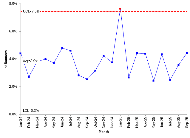
With an X chart, the individual data is plotted – in this case, the % of bounces per month. The average () for the % of bounces is calculated and added to the control chart. The lower control limit (LCL) and the upper control limit (UCL) are calculated and plotted on the X chart as well. For detailed information on these calculations and what they mean, please see our SPC Knowledge Base section on control charts. Or see our “SPC Insights with Dr. Bill” on our YouTube channel.
The key is to interpret the control chart. As long as all the points are within the control limits and there are no patterns (like 8 in a row above or below the average), the process only has noise. In control chart terminology, the process only has common cause of variation present and is in statistical control. You don’t know what the % bounces will be next month, but you know, since there is only noise in the process, the next month will be between the LCL and UCL with a long term average of .
However, if there is a point beyond the control limits or a pattern, there is a special cause of variation present. The control chart has detected a signal. Something has changed. For more information on interpreting control charts, please see our SPC Knowledge base articles on control chart basics. You can also see our video on interpreting control chart.
The process depicted in Figure 1 has one point beyond the control limits. This is a signal that something changes for that point. It is best to find out what happened and stop it from happening again.
So, control charts separate the signal from the noise and let you know when you need to take action. This helps your detect changes early.
Reasons to Use Control Charts in Digital Processes
A process is a process – whether it is the traditional manufacturing process or a digital process. Processes turn inputs into outputs. And as they do this, they have variation – times vary, defects occur, rework occurs. Digital processes can have issues – just like the traditional manufacturing processes can.
Control charts help manage these processes. They separate the signals from the noise as we just described. Once in control, we can confirm that the process remains stable – consistent and predictable – over time. Then we can determine the process capability.
Control charts also help prevent our tampering with the process. Adjusting a process that is in statistical control (stable, only common causes of variation present) actually increases the variation in the process. When you tamper, you are responding to noise – not to signals. So, control charts help prevent that. The funnel experiment is a great way to demonstrate what tampering with the process now. You can see our video on the funnel experiment at this link.
Application of Control Charts in Digital Processes
There are many potential applications of control charts in digital processes. Examples are shown below (with ChatGPT’s help).
IT, DevOps, and Cloud Operations
- Software builds and deployments
- Build duration
- Failure rate,
- Frequency
- API or service monitoring
- Latency
- Error Rate
- Throughput
- Cloud Storage Usage
- CPU load
- Memory
- Response time
- Incident Management
- Mean time to detect/resolve
Automation & Data Pipelines
- ETL (Extract–Transform–Load) jobs
- Run time,
- Record count variance
- Machine learning retraining
- Model accuracy
- Count variance
- Data ingestion
- Record error rates
- Batch processing
- Run time variance
- Throughput
Business Operations and Finance
- Invoice processing
- Time to approve
- Errors pre batch
- Expense reimbursement
- Cycle time
- Payroll processing
- Exception rate
- Purchase orders
- Approval turnaround
Customer Support and Service Operations
- Ticket resolution
- Cycle time
- Backlog size
- Chatbot interactions
- Response success rate
- Customer satisfaction
- Rolling average
- Call center operations
- Wait time
- Abandonment rate
Sales, Marketing, and Product Analytics
- Lead processing
- Qualification cycle time
- Email campaigns
- Bounce rate
- Click-through rate
- A/B testing
- Conversion variance
- Product analytics
- Session duration
- Error rate
Many of these metrics, not surprisingly, are the same as for the manual processes but will require different methods to collect the data. It is best to automate the data collection process, ensuring the data is time-stamped.
What Type of Control Chart Should Be Used with Digital Processes
Keep it simple. The best control chart to use, as well as the easiest to understand, is the individuals (X-mR) control chart. This doesn’t mean that you are plotting each individual value. You may be looking at daily averages, plotting one data point per day. But the X-mR control chart should handle most of your needs for a control on digital process. If there is lots of data and you need ideas on how to handle it, please see our SPC Knowledge Base article called Control Charts and Data Overload.
Summary
Digital processes are being used more and more over time. Thes processes produce data. And we can use that data to help monitor the process through the use of control charts. This publication introduced how this can be done using an individuals chart. Examples of metrics that can be used in control chart were given.
Hi Bill, the example uses percentages (proportions). Many folks would gravitate first toward a p-chart for this. It would be helpful to list the rationale for using X and MR rather than p. Near the end, the article states that X and MR is the easiest to understand. Is there also a statistical rationale for preferring X and MR? Thank you.
Hello Kevin,
There are 4 conditions that have to be met to use a p-control chart; in reality these are seldom met. See this article: Comparing Individuals Charts to Attributes Charts – SPC for Excel Plus, you don’t have to worry about varying subgroup size with the X-mR chart. No statistical rational. X-mR just work in the vaste majority of cases.