March 2024
 Let’s return to some basics of control charts in this publication. A control chart is used for a variety of reasons, including monitoring a process for signals that something has changed. A control chart is really a movie of your process over time. It helps identify the magnitude and type of variation (special causes or only common causes) present. How do control charts do this? Is there a role for specifications in the use of control charts? This publication explores how control charts work using two examples.
In this publication:
- Introduction
- Control Chart Review
- Example 1: In Spec but Out of Control
- Example 2: In Control but Out of Spec
- Summary
- Quick Links
Please feel free to leave a comment at the end of this publication. You can download a pdf copy of the publication at this link.
Introduction
We often compare our process results to some value – usually a specification. If the process result is within the specification limits, we assume life is good and go forward. If the process result is not within the specification limits, we want to find out why. This seems reasonable. What is missing here is that if you just compare the process result to another number, you are missing what the underlying process is doing – and by listening to your control chart, it will tell you where you need to look to find a problem – if there is one.
Control Chart Review
We will start with a quick review of control charts. A control chart monitors variation in a process over time. It separates common causes of variation from special causes of variation. Common causes of variation represent the “noise” in the process. It is the normal or natural variation that exists in the process. It exists because of the way you designed the process and manage it on a day-to-day basis.
A good example of this is the time it takes you to get to work in the morning. There is a certain amount of “normal variation” in that process. There is an average time it takes to get to work with some variation about that average. Maybe that variation is 15 to 25 minutes. This variation is normal for you, and you expect it. This is common causes of variation – the normal variation in the process.
A special cause of variation represents a “signal” that something has changed in the process. For example, if you get a flat tire on the way to work, you will not be getting to work in your normal time variation of 15 to 25 minutes. It will be much later most likely. This is a special cause of variation in the process. It is not part of the way the process is designed and is managed. It is not supposed to be there.
A control chart separates the common causes of variation from the special causes of variation. All processes have noise – the common causes of variation. Some processes have signals – the special causes of variation that indicate something has changed. When a special cause of variation exists, you should find the reason for the special cause and remove it from the process – hopefully preventing it from coming back again. For more information on variation, please see our SPC Knowledge Base articles at this link.
A control chart is the only effective way to separate the signals from the noise. This is done by plotting the data (like the time to get to work) over time. Once you have enough data, you calculate the average and the control limits. There are usually two control limits. One is the upper control limit (UCL). This is the largest value you would expect if you just had common causes of variation present. The other is the lower control limit (LCL). This is the smallest value you would expect if you just had common causes of variation present.
After you have plotted the average and control limits, you interpret the control charts. If there are no points beyond the control limits or patterns (like 8 in a row above the average), the process only has common causes of variation (noise) present. The process is said to be in statistical control. If there is a point beyond the control limits or patterns present, then the process is sending a signal that something has changed.
Now let’s look at two examples that give insights into how control charts work.
Example 1: In Spec But Out of Control
Suppose your company makes a product whose color is very important to the customer. The color is measured using a colorimeter. The lab checks the calibration of the colorimeter daily to see if it requires calibration. This calibration is done by measuring the color of a standard plate. The colorimeter manufacturer says the standard plate should read 100 ± 10. So, the upper specification limit (USL) for the color of the standard plate is 110. The lower specification limit (LSL) is 90. When the standard plate is measured, the technician records the result. As long as the result is within 90 to 110, the colorimeter is considered calibrated. If it is outside that range, the colorimeter is assumed to need calibration. The results from running the standard plate for the past twenty days are shown in Table 1 below.
Table 1: Standard Plate Color Results
|
Sample Number |
Result |
Sample Number |
Result |
|
|
1 |
100 |
11 |
94 |
|
|
2 |
101 |
12 |
92 |
|
|
3 |
101 |
13 |
94 |
|
|
4 |
99 |
14 |
98 |
|
|
5 |
104 |
15 |
108 |
|
|
6 |
99 |
16 |
104 |
|
|
7 |
99 |
17 |
95 |
|
|
8 |
96 |
18 |
96 |
|
|
9 |
97 |
19 |
96 |
|
|
10 |
97 |
20 |
97 |
What does this table of numbers tell you about the colorimeter? Sometimes it is hard to judge much from a table of numbers. If you look long enough, you will see there are no values below 90 or above 110. It doesn’t look like the colorimeter needs to be calibrated. But, as they say, a picture is worth a thousand words. So, lets chart the results for the standard plate. This chart is shown in Figure 1.
Figure 1: Run Chart for Example 1 Data
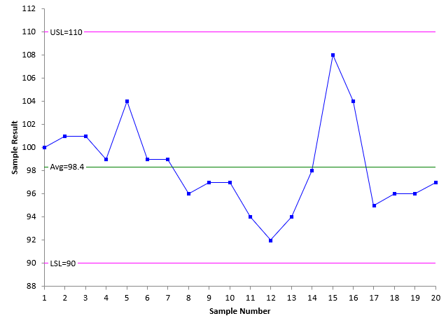
What does this chart tell you about the standard colorimeter plate? All looks good. The specifications have been added to the chart. All points are within the specifications. The average is 98.4, not too far from the standard plate average.
Where do these specification limits come from? They come from the manufacturer and are probably based on past data of where similar colorimeters should operate. But, to a certain extent, these specifications are arbitrary. Why not ± 5 instead of ± 10? Why not ± 8? How about ± 6?
But, like most processes with specifications, who sets those specifications? Do specifications take into account the way the process behaves? No, not usually. Specifications come from an external source to the process. In this example, it is the manufacturer of the standard colorimeter plate. Specifications often come from the customer. Sometimes specifications come from management. Considering only specifications, Figure 1 looks pretty good.
The problem with comparing results to specifications only is that this comparison doesn’t tell you anything about the underlying process. In this case, the process is the measurement of the standard plate using the colorimeter. How do you know what is going on with the process only by comparing it to specifications? The answer is that you do not. The only way to really see what is happening with the process is by plotting the data over time as a control chart. This is how you see if the process is consistent and predictable.
So, what do control charts add to this situation? If you are going to construct a control chart based on the data in Table 1, the individuals control chart (X-mR) is the best chart to use. The individuals control chart is really two charts. One chart is the X chart, where each individual result is plotted (like in Figure 1). The other is the moving range (mR) chart where the range between consecutive points is plotted.
The average and control limits are calculated and added to each chart. An important point: the control limits are not set by anyone. They are determined by the process itself and how it is sampled. Mathematical formulas are used to calculate the control limits. Once the control limits are added to the control chart, it can be interpreted.
Figures 2 and 3 show the X and mR control charts for the colorimeter standard plate.
Figure 2: X Chart for Example 1 Data
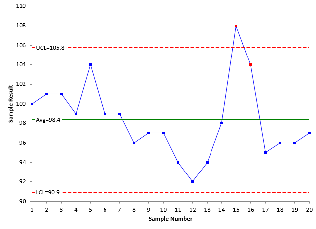
Figure 3: mR Chart for Example 1 Data
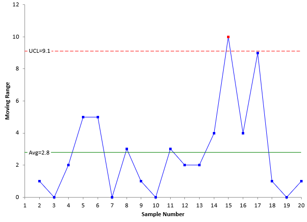
Figures 2 and 3 do not show a process that is in control. There are points beyond the control limits on both charts and an out of control point based on the test for Zone A (2 out of 3 consecutive points in zone A or beyond). For more information on interpreting control charts, please see our SPC Knowledge Base article on Which Out of Control Tests Should I Use.
Since there are out of control points, this means that the colorimeter standard plate results are not consistent and predictable. There are special causes of variation present. Since the process is not consistent and predictable, you cannot predict what will happen in the future. This is true even though all 20 samples fell within the manufacturer’s specification limits. We don’t know that the colorimeter will stay there since the process is not stable. We need to find the reason for the special cause and remove it.
Example 2: In Control But Out of Spec
Suppose you have another colorimeter that you use from time to time as a backup. The specifications are the same for the standard plate: 100 ± 10. The last twenty results obtained when measuring the standard plate for color are given in Table 2. Examine the table of numbers.
Table 2: Standard Plate Color Results
|
Sample Number |
Result |
Sample Number |
Result |
|
|
1 |
104 |
11 |
98 |
|
|
2 |
102 |
12 |
85 |
|
|
3 |
95 |
13 |
100 |
|
|
4 |
89 |
14 |
112 |
|
|
5 |
83 |
15 |
98 |
|
|
6 |
98 |
16 |
98 |
|
|
7 |
103 |
17 |
102 |
|
|
8 |
98 |
18 |
98 |
|
|
9 |
87 |
19 |
113 |
|
|
10 |
102 |
20 |
93 |
What does this table of numbers tell you about the back-up colorimeter? Again, it is not easy to see, but if you go through the table, you will see some results below the LSL and above the USL. What does the chart of the results versus the specifications look like? This is shown in Figure 4.
Figure 4: Run Chart for Example 2 Data
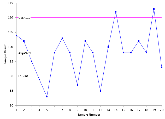
There are clearly points that are beyond both specification limits. So, based on the manufacturer, this colorimeter needs to be calibrated. But does it? What does the control chart show? Figures 5 and 6 are the X and mR charts respectively for the Example 2 data.
Figure 5: X Chart for Example 2 Data
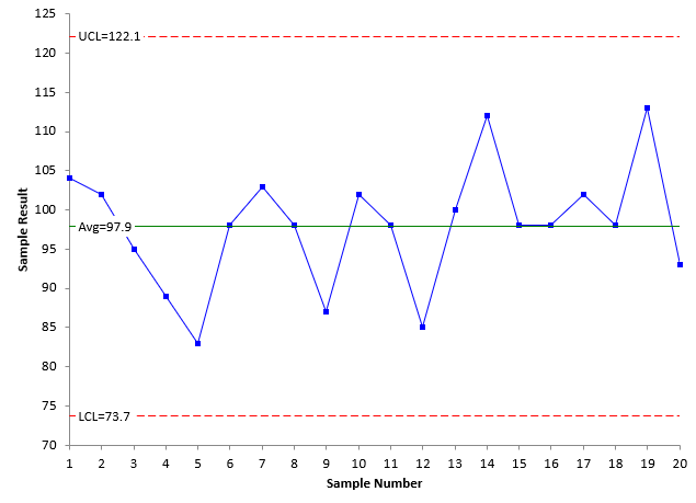
Figure 6: mR Chart for Example 2 Data
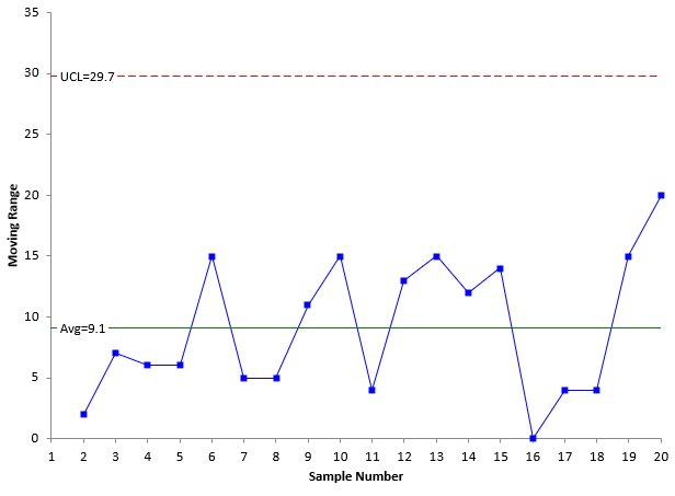
In this example, the colorimeter results are in statistical control. This means that the colorimeter is consistent and predictable. Being in control does not mean being within specifications. In this case, the colorimeter often gives results that are outside the manufacturer’s suggested specifications when running the standard plate. Yet, only common cause of variation is present. The only way to improve this process is to fundamentally change the process- if it needs to be improved. There appears to be too much variation in the results, but there is no need to recalibrate the colorimeter. There has not been a signal that the process has changed.
This concept of variation seems relatively simple. However, in practice it is difficult. Many people don’t understand the concept of variation. The tendency is to respond to whatever the last data point was. For example, suppose your process involves drying a product in a fluid bed type dryer. Moisture measurements are taken on a routine basis at the exit of the dryer. The tendency for many people is to increase the drying temperature if one result is higher than the previous result. This tendency actually increases the variation in the process (over-controlling). The correct approach is to use a control chart to monitor the moisture content. As long as the process remains in control, no action is taken on the up and downs in the moisture measurements. If a point goes beyond the control limit, action is then required. The action required is to find out what caused the point to be beyond the control limit.
Summary
This publication went back to some of the basics of control charts. It is important to remember that control limits on a control chart, done properly, are determined by the process. They are not like specifications which come from an external source to the process. That is why control charts with the control limits represent the voice of the process. The control chart will tell you when something has changed in the process, and it needs attention. Specifications cannot do that.