Individual/Interval/Beeswarm Plots
Home » SPC for Excel Help » Statistical Tools » Miscellaneous Tools Help » Individual/Interval/Beeswarm Plots
This help page shows how to create an individual plot, interval plot and beeswarm plot using the SPC for Example software.
An individuals plot shows the how the individual values are distributed so you can compare different data sets to see if there a difference in average or amount of variation.
An interval plot shows the mean and the 95% confidence limits around the mean to easily see if there are differences in the mean or variation between data sets.
A beeswarm plot is a visual way of seeing individual data points and how they are distributed.
You may download the data at this link.

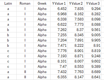
- Enter the data into a spreadsheet as shown below. The data must be in columns with the variable name in the first cell of each column. A partial example of the data is shown below.
2. Put the cursor in a cell within the data, e.g., like the upper left hand corner of the data. The software will select the data around the cursor to include in the analysis.
3. Select “Misc. Tools” from the “Statistical Tools” panel on the SPC for Excel ribbon.
4. Select “Individual/Interval/Beeswarm Plot” .
5. The input screen below is shown.

- Categorical Variables - 0 to 3: You can select from 0 to 3 variables with categorical values for the plot.
- Select First 3 in Order: Option to select the first three categorical variables.
- Numerical Variables - Select 1 or more: Select the numerical variables to include in the plot.
- Select All Values: Option to select all the numerical variables.
- Select Output: Option to place plot on chart sheet or embedded on a new worksheet
- Select Plot Type: Select either individual Plot, interval Plot or Beeswarm Plot; individual plot is the default.
- If beeswarm option is selected: the minimum and maximum of the data values are shown. Enter the bin width for the beeswarm plot. If the data are integer values and you want a beeswarm plot for each value, enter 1 as the bin with.
- Select OK to generate the results.
- Select Cancel to end the program.
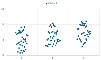
Individual Plot Output
The output from individual plot is shown below. The “Latin” categorical variable was selected along with Y Value 1. A new worksheet is added to the workbook to contain the results. The plot allows you to compare the variation and locations of each combination of the data.
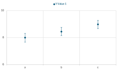
Interval Plot Output
The output from the interval plot is shown below. The “Latin” categorical variable was selected along with Y Value 1. A new worksheet is added to the workbook to contain the results. The plot allows you to compare the variation and locations of each combination of the data.
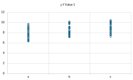
Beeswarm Plot Output
The output from the beeswarm plot is shown below. The “Latin” categorical variable was selected along with Y Value 1. A new worksheet is added to the workbook to contain the results. The plot allows you to compare the variation and locations of each combination of the data.