Group Histogram Help
A Group Histogram displays two or more different variables on the same histogram. For example, you may have two suppliers providing the same raw material and want to see how the variation in the suppliers differ. This page shows you how to make a Group Histogram. The data can be downloaded at this link. This page contains the following:

Data Entry
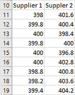
The data are entered into a worksheet as shown below (just part of the data in the example workbook is shown). The data in this example are in columns – one column per variable (supplier). The data could be rows – one row per variable. The first cell in the selected range for each column is assumed to the variable (e.g., Supplier 1 and Supplier 2). The data does not have to start in A1. It can be anywhere on the spreadsheet.
Creating a New Group Histogram
- 1. Select the data entered into the worksheet as shown below.
- 2. Select “Group” from the “Histograms” panel on the SPC for Excel ribbon.
- 3. The input screen for “Group Histogram” is shown. The default data range is the range you selected on the worksheet. This will be the range that is included in the histogram. You can edit the range if needed here. Enter a name for the chart. This is all that is needed to make the histogram. This is the name that will be on the worksheet tab containing the histogram. In this example, the name “Suppliers” is used as the name of the histogram.
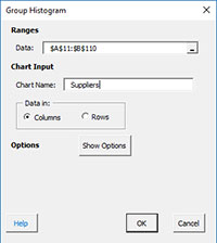
- Data: range containing the data to use in the histogram, may be edited if not correct
- Name of chart: chart name for worksheet tab containing the Group Histogram – must be a unique name in the workbook and is limited to 25 characters
- Data in: either columns or rows; based on how variables are listed; one column per variable or one row per variable
- Show Options: selecting this button shows the various options for the Basic Histogram (see options below)
- Titles, Rounding, Dates
- Specs, Nominal
- Select OK to create the Group Histogram
- Select Cancel to exit the program
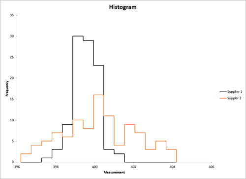
A completed Group Histogram for the data in the example workbook is shown below.
Options for the Group Histogram
On the input screen for the Group Histogram is the button labeled “Show Options”. If you select that button, the input screen will show the options for the Group Histogram. Each option is described below. It is not required to select any of these options.
Titles, Rounding, Dates
This option is the same as for the Basic Histogram.
Specs, Nominal
If you select this option, the input screen below is displayed.
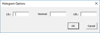
- LSL: enter the lower specification limit
- Nominal: enter the nominal value
- USL: enter the upper specification limit
- Select OK to use selected options
- Select Cancel to revert to previous options
LSL, nominal and USL are each optional.
Updating the Group Histogram with New Data
The Group Histogram can be easily updated with new data after it has been added to the spreadsheet. Select the “Update Charts” on the Updating/Options panel on the SPC for Excel Ribbon.
Then select the chart you want to update. See Updating Charts for more information.
How SPC for Excel Finds New Data to Update the Group Histogram
When a chart is updated, the program will search for new data based on the option selected for the data being in columns or rows (see the first input screen above). If the data are in columns, the program starts with the first cell in the first variable range, and searches down the column to find the last entry before an empty cell. A similar process applies if the data are in rows.
Changing the Options for the Group Histogram
You can change the current options for a histogram (e.g., to add specs) by selecting “Options” on the Updating/Options panel on the SPC for Excel Ribbon.
The list of available charts in the workbook will be displayed. Select the chart you want to change options for. The input screen for that chart will be shown and changes can be made. See Changing Chart Options for more information.