Variability Chart Help
Home » SPC for Excel Help » Analysis Help » ANOVA Help » ANOVA Output Help » Variability Chart Help
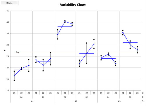
If the “Variability Chart” option was selected on the output options, a chart sheet is added and the variability chart plotted. The variability chart from this example is shown below. This example includes the two options for plotting the treatment averages (joined by the blue lines) and the overall average.

The x-axis on the chart shows the factors. You can change the order of the factors by selecting the “Revise” button in the upper-left hand corner of the chart. This works for 2 to 4 factors. In this example, if you select the “Revise” button, you will get the following input form:
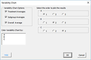
You can change the order to plot the results. The “1” spot corresponds to the bottom factor on the chart.
You can also change the option to add the treatment average or overall average as well as the option to color the variability chart by levels of one factor. These options are available by selecting the tab called “Chart Options”
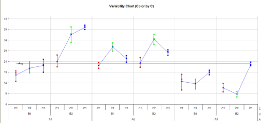
The chart below is the variability chart colored by the levels of factor C. Level C1 is red; level C2 is green and level C3 is blue.