Moving Average/Moving Range Chart Help
The moving average/moving range chart (MA/MR) is used when you only have one data point at a time to describe a situation (e.g., infrequent data) and the data are not normally distributed. The MA/MR chart is very similar to the Xbar-R chart. The only major difference is how the subgroups are formed and the out of control tests that apply. The steps in constructing the moving average/moving range chart are essentially the same as the Xbar-R chart.

This page shows you how to make the MA/MR chart. The data can be downloaded at this link. This page contains the following:
Subgroup Formation
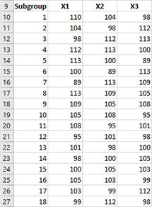
The MA/MR chart reuses data. For example, the data below shows the accounts receivable for each week. The data could be regrouped into subgroup sizes of three and analyzed using a MA/MR chart. The first subgroup for the MA/MR chart is formed using the first three results (for the weeks of 1/6, 1/13, and 1/20). The second subgroup for the MA/MR chart uses the weeks of 1/13 and 1/20 and then adds in the week of 1/27. The data for weeks 1/20 and 21/27 are reused in the next subgroup. This continues for each of the remaining samples. This approach allows you to plot a point with each new data point instead of waiting for three data points to form a subgroup.
Data Entry
This example will use the accounts receivable data above. You enter the data are entered into a worksheet as shown below The data does not have to start in A1. It can be anywhere on the spreadsheet. The data can be in rows or in columns. In the example workbook, the data starts in cell A10 as shown below.
Creating a New MA/MR Chart
- 1. Select the data on the worksheet to be included in the analysis. You can use “Select Cells” in the “Utilities” panel of the SPC for Excel ribbon to quickly select the cells.
- 2. Select “Variable” from the “Control Charts” panel on the SPC for Excel ribbon.
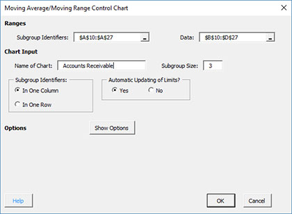
- 3. The input screen for variable control charts is displayed. The Moving Average/Moving Range chart is on the “Time Weighted Charts” tab.
- 4. Select “Moving Average/Moving Range Chart” from the “Time Weighted Charts” tab. Select OK.
- 5. The input screen for the chart is then displayed. The program sets the initial subgroup identifiers and data ranges (cells A10:A27 and cells B10:D27 in the example workbook) as well as the subgroup size based on the range you selected on the worksheet. This is why there is an advantage to selecting the subgroup and data ranges prior to making the chart. You can edit the ranges if needed here. Enter a name for the chart. In this example, the name “Accounts Receivable” is used as the name of the chart. This is the name that will appear on the worksheet tab containing the chart. It must be unique – there can not be another workbook tab with that name.
This is all that is needed to make the chart. If you select OK at this point, the software will generate the chart using the default options. Simple and quick.
The options on the input screen are:
- Subgroup Identifiers: the worksheet range containing the subgroup identifiers
- Data: the worksheet range containing the data in subgroups
- Name of Chart: chart name – must be a unique name in the workbook and is limited to 25 characters
- Subgroup Size: enter the subgroup size; default value is determined by the range selected on the worksheet; maximum subgroup size is 100 (note: if you change the subgroup size here, the software will adjust the data range)
- Subgroup Identifiers: this information is used to search for new data when updating the chart (see below)
- In One Column: the subgroup identifiers are in one column (as in this example)
- In One Row: the subgroup identifiers are in one row
- Automatic Updating of Limits: option controls whether the average and control limits are updated as new data are added, default value is Yes; set this to No to stop the average and control limits from updating
- Show Options: selecting this button shows the various options for this chart (see options below)
- Out of Control Tests
- Control Limit Options
- Titles and Formats
- Manual Control Limits
- Chart Location
- Select OK to create the chart
- Select Cancel to exit the software
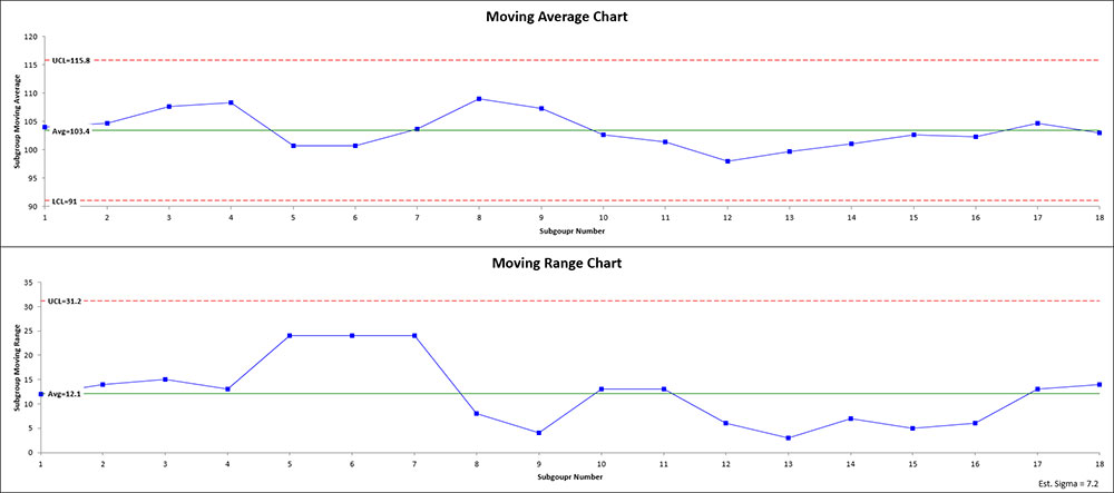
- 6. Once you have select the options you want (again, no options are required to make the chart), select OK and the chart will be generated. An example based on the data above is shown below.
Options for the MA/MR chart
On the input screen above for the chart, there is a button labeled “Show Options”. If you select that button, the input screen will show the options available for the chart. It is not required to select any of these options.
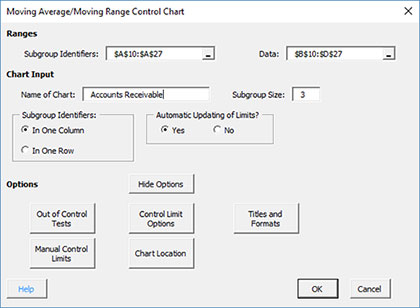
Each option is described below.
Out of Control Tests
If you select the Out of Control Tests, the input screen, Tests for Out of Control Points, is displayed below.
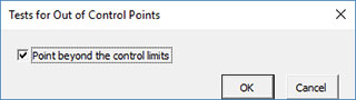
Since the data are re-used on the moving avearge/moving range chart, there is only one option for out of control points.
- Point beyond the control limits: out of control if a point that is above the upper control or below the lower control
Control Limit Options
f you select the “Control Limit Options” button, the following is displayed.
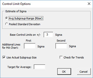
The options include:
- Estimate of Sigma: defines the way the software estimates sigma (standard deviation)
- Avg. Subgroup Range (Rbar): estimates sigma from the average subgroup range
- Pooled Standard Deviation: estimates sigma from the pooled standard deviation
- Based Control Limits on +/- ___ Sigma: defines how to calculate the control limits; default is +/- 3 sigma
- Additional Lines for MA Chart: the software allows you to add two additional lines to the chart based on multiple of sigma; additional lines are added above the average and below the average; this option will override the option of putting the 1 and 2 sigma lines shown on the Out of Control Tests option.
- Use Actual Subgroup Size: option to use actual subgroup size to determine control limits if subgroup size varies; default is checked; if not checked, the software uses the subgroup size entered on the chart input screen.
- Check for Trends: option to check for trends; if present, a trend chart will be made using the best-fit line
- Target for Average: option to enter a target for the average
- Select OK to use selected options
- Select Cancel to revert to previous options
Note: the additional lines, check for trends and target for average options apply only to the moving average chart.
Titles and Formats
If you select the “Title and Formats” button, the following screen is displayed:
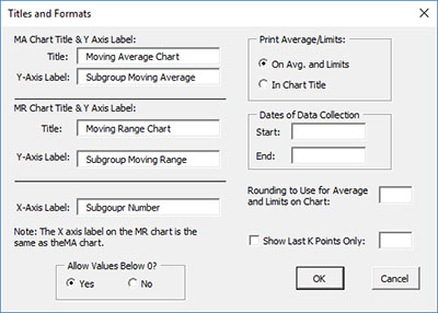
The options include:
- MA Chart Title & Y Axis Label:
- Title: title at the top of the moving average chart; default is “Moving Average Chart”
- Y-Axis Label: label to put on the moving average chart vertical axis; default is “Subgroup Moving Average”
- MR Chart Title & Y Axis Label:
- Title: title at the top of the moving range chart; default is “Moving Range Chart”
- Y-Axis Label: label to put on the moving range chart vertical axis; default is “Subgroup Moving Range”
- X-Axis Label: label for the horizontal axis for both the moving average chart and the moving range chart; default is “Subgroup Number”
- Allow Values Below 0?: select Yes to allow values below 0 on the chart; select No to keep the chart from showing anything below 0; default is Yes
- Print Average/Limits:
- On Avg. and Limits: prints the values of the average and control limits on the average and control limit lines on the chart (this is the default)
- In Chart Title: prints the values of the average and control limits in the chart title
- Dates of Data Collection: enter the start and end dates of data collection; optional; dates will be plotted at the bottom of the chart
- Rounding to Use for Average and Limits on Chart: used to control the number of decimal places in the values of the average and control limits printed on the chart; default is estimated by the software
- Show Last K Points Only: option to show only the last K points of the chart; calculations include all the data but only the last K points will be shown
- Select OK to use selected options
- Select Cancel to revert to previous options
Manual Control Limits
If you select the “Manual Control Limits” button, the following screen is displayed:
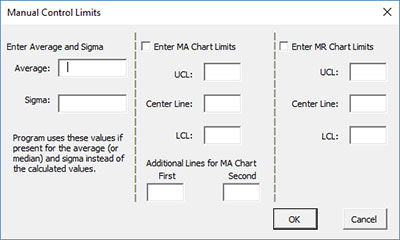
The options include:
- Enter Average and Sigma: the software uses these input values instead of those calculated by the software
- Average: enter the average to be used in the calculations
- Sigma: enter the standard deviation to be used in the calculations
- Enter MA Chart Limits: if you select this option, you must enter at least one of the UCL, centerline, and LCL; the software will calculate the values that are not entered
- UCL: enter the upper control limit
- Center Line: enter the center line value
- LCL: enter the lower control limit
- Additional Lines on MA Chart: the software allows you to plot two other lines with manual entry; lines are plotted above and below the center line; this option overrides the options above to plot lines at +/- x sigma.
- Enter MR Chart Limits: if you select this option, you must enter at least one of the UCL, centerline, and LCL; the software will calculate the values that are not entered
- UCL: enter the upper control limit
- Center Line: enter the center line value
- LCL: enter the lower control limit
- Select OK to use selected options
- Select Cancel to revert to previous options
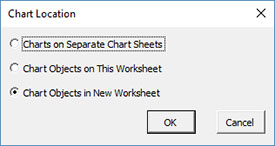
Chart Location
If you select the “Chart Location” button, the following screen is displayed.
The options are:
- Charts on Separate Chart Sheets: places one chart on one chart sheet and the other chart on another chart sheet
- Chart Objects on This Worksheet: places both charts on the worksheet containing the data
- Chart Objects in a New Worksheet: places both charts on a new worksheet
- Select OK to use selected options
- Select Cancel to revert to previous options
Notes:
- Once a chart is made, you can move the chart to new locations in the workbook. The software will find the chart when updating.
- This option is not available when a chart’s options are updated since you can manually move the charts to new locations in the workbook
Changing the Options for the MA/MR Chart
You can change the current options for a chart (e.g., adding a Box-Cox transformation) by selecting “Options” on the Updating/Options panel on the SPC for Excel Ribbon.
The list of available charts in the workbook will be displayed. Select the chart you want to change options for. The input screen for that chart will be shown and changes can be made. See Changing Chart Options for more information
In addition, once a chart is made, there are numerous actions you can take on the chart including splitting control limits, removing points from the calculations, adding comments, selecting the range on which to base control limits, etc. Please see Control Chart Actions for details.